


Three proposals are on your desk, and each UI design company talks about research, design and delivery. On paper, the only differences are price and how polished the portfolio images look. But the right choice depends on evidence: the team's actual role in its samples, testing with real users, and the quality of the handoff to your technical team. Measure those against the same scope with one scoring table, and the real differences between proposals surface on their own.
Before comparing, let's agree on two terms. The user interface (UI) is what users see and interact with: buttons, forms, menus, error messages. User experience (UX) is the quality of the whole journey of getting something done. In other words, it's how easily and how error-free users reach their goal. A good UI design company has evidence in both layers, not just the one that catches the eye.
What should you check when choosing a UI design company?
Short answer: when choosing a UI design company, assess these six things. They're exactly where claims and evidence tend to drift apart:
how well the team's experience fits your problem, not just your industry;
the team's actual role in the portfolio pieces it shows;
evidence of user research and testing;
the quality of the interactive prototype, meaning the clickable version of the design;
editable deliverables, not just images;
the terms of handoff to the technical team and of collaboration afterward.
Then compare proposals on the same scope, with a named owner, approval points and a scoring table. Price and attractive images aren't enough. They say more about taste than about the quality of the work.
You won't find “the best UI design company” in any public ranking. The best option for you is a team that fits your problem, your constraints and your own capacity to collaborate. A team that did excellent work on a large banking system, for example, may be too heavy and too slow for a small product on a tight budget.
If the line between these two concepts still isn't clear to you, read What is UI design and how is it different from UX? first. This article covers only one thing: choosing who does the work.
Is a company or a freelancer better for your project?
It depends on the size and complexity of the work. When the scope is limited and you have a product manager available, a skilled freelancer is often enough. If you have several complex workflows and coordination has to be continuous, you need the capacity of a team. That said, the word “company” alone isn't a sign of quality. Sometimes a whole project rests on one person's shoulders behind a brand name.
To decide between a freelancer and a UI/UX design company, put these four criteria side by side:
Criterion | Freelancer | Company or team |
|---|---|---|
Real capacity | Limited to one person's free time | The number of people actually working on your project, not total headcount |
Backup owner | Usually none | The team should name this person from the start |
Direct access to the designer | Direct and fast | Sometimes only through a project manager |
Coordination cost | Low, but the management burden falls on you | Higher, but the team takes on part of the management |
Suppose you only want to redesign the sign-up form of an app. The problem is clear, the users are a single group, and one person makes the decisions. An experienced designer can handle that well alone, because there's almost nothing left to coordinate.
Now picture a system where managers, staff and customers each have their own dashboards and permissions. Here you need research with several user groups, a record of decisions and thorough documentation. Under that load, one person either moves slowly or drops part of the work. That's why, for a project like this, a UI design company with clearly divided roles is the more sensible choice.
So whether you're talking to a freelancer or a UI design company, ask one question every time. If the lead designer leaves the project, how do the files and the project knowledge reach the next person? A good answer has three parts: a well-organized file structure, documented decisions and the name of a backup.
How do you evaluate a portfolio beyond pretty images?
Treat each portfolio piece as the case file for a decision, not as a gallery. For every UI design sample, ask the team for five things: the original problem, the users, the constraints, the key decisions and a provable outcome. Almost every UI design company has pretty images. These five things are what set teams apart.
Then move on to the interactive prototype. A prototype is a clickable version of the design that shows how the product behaves before any code is written. Ask the team to run one main flow live. Then look at three states: an input error, waiting for content to load, and no data. Most weaknesses show up right here, because many teams draw these states at the very end, in a rush.
To make this concrete, imagine two teams presenting an entirely hypothetical online booking project. Here's how the two presentations differ:
Part of the presentation | Weak presentation | Documented presentation |
|---|---|---|
Problem | None; jumps straight to the final screens | Booking conflicts when two users pick the same time slot at the same moment |
Flow | A few separate, unconnected screens | The flow for choosing a service, a day and a time, including fully booked slots |
Testing | Not mentioned | Users found the calendar too late, so the team moved day selection to the top of the page |
Outcome | A vague line about a great user experience | Fewer errors in the second round of testing, with the test conditions and number of participants explained |
Also tell two kinds of claims apart. “Users got stuck less in the second test” is evidence of improved usability. “Sales doubled” is a business claim, and without data, a time frame and context it proves nothing. Sales also depend on price, advertising and season, not just on design.
In a portfolio, the reason behind each decision matters more than how the end result looks.
Sometimes, though, a team can't show the full file because of a confidentiality agreement. That's normal. An anonymized version, images with dummy data or a verbal walkthrough of the decisions is a reasonable substitute. A flat refusal to explain anything is not.
How do you check the team's actual role in a project?
For each sample, ask who did the research, the flow structure, the visual design and the handoff. The second question matters more: which of these people are still on the team and will work on your project? If the lead designers on that sample have left, it no longer reflects what the team can do today.
Next, ask for a live walkthrough: part of the file, its version history or a change log. This is only appropriate with the project owner's permission and without confidential information. In these walkthroughs I usually check the file structure first: how layers are named, the reusable components and the different states of a button. A file with nothing but glossy screens and not a single error state tells you the designer worked for show, not for building.
A limited contribution is not the same as responsibility for the whole design. A team that only drew the icons for a large app shouldn't present the entire app as its own work. Using a ready-made template or a UI kit, a prebuilt set of buttons and components, isn't necessarily a problem either. The problem starts when a UI design company hides its real share.
One question has always served me well in these meetings: “Which design decision did you change mid-project, and what evidence made you change it?” A team that really did the design has an example ready and tells it without hesitating. But don't ask for free work to get that answer, and don't request a previous client's confidential files.
What should you ask about research and testing in the first meeting?
Ask three things in the first meeting: which assumption the team considers riskiest, how it finds users, and how test results change the design. Before that, though, separate two terms, because many proposals blur them together.
User research means understanding the problem and the audience's real behavior before any design exists. Usability testing means a user carries out a specific task with the design while you watch where they get stuck. Asking people whether they like how a page looks isn't usability testing. So if a UI design company talks about “user testing” and only means asking “Do you like it?”, no testing has happened yet.
Take these four questions with you to the meeting:
What is this product's riskiest assumption, and how will you test it?
Where will you find test participants?
Who provides access to those users, you or us?
Where do you record each test's results, and how do they turn into design changes?
In some projects, access to real users simply isn't possible. Think of internal software whose staff have no time for testing. In that case the team should write down its assumptions and state how far the evaluation can be relied on. An expert review, where an experienced designer goes over the design against usability principles, is useful. But it isn't equivalent to testing with users, and a team that passes one off as the other has hidden the risk from you.
In the hypothetical booking test, for instance, you ask a user to move their appointment to next week. A good report notes where the user paused, what mistakes they made and whether they asked for help. “The user was satisfied” on its own teaches the designer nothing.
Don't forget accessibility. Accessibility means people with low vision, or people who don't use a mouse, can also use the product. Ask how the team checks text legibility, keyboard navigation and the clarity of error messages. The common reference here is the Web Content Accessibility Guidelines, or WCAG. A serious UI design company will tell you which parts of the product it checks against these guidelines. A claim of full compliance without any testing, however, is not a good sign.
How should deliverables, timelines and approval points be defined?
Instead of counting screens, define deliverables by listing flows, user roles and states. Next to each one, write an acceptance criterion: the condition that tells you the deliverable is complete. Screen count alone doesn't show the scope. Thirty simple screens and ten screens with five states each are not the same job; the second is effectively 50 separate states to design.
Every UI design company's proposal should name specific flows such as sign-up, checkout and order tracking. Then set a criterion for each deliverable that you can check in the handoff meeting:
Deliverable | Acceptance criterion |
|---|---|
User flow map | Shows every priority flow with its start point, end point and branches |
Wireframe (initial layout) | Gets the structure and content priority approved by you before visual design begins |
Interactive prototype | Main flows are clickable, including error states |
Final file | Includes empty, loading, error and success states for every screen |
Reusable component set | Each component has a clear name and defined states so the technical team builds it once; this is the seed of a design system |
The acceptance criterion for a payment flow, for example, could be: “The flow covers successful payment, failed payment and retry, and the technical team understands how each state behaves without further questions.” You can check that sentence easily in the handoff meeting. Either it holds or it doesn't.
A design without error states was drawn only for the user's good days.
A design timeline also doesn't depend on the designer's speed alone. Content supply, access to users, how quickly you respond and sign-off from the technical team all play a part. Quite often a project falls behind not at the designer's desk but in the approval queue, or while everyone waits for content. So instead of a promise of a fixed duration, ask the UI design company to write the dependencies and the owner of each approval into its proposal. For example: “User flow map approved by the product manager within three business days of delivery.”
Also pin down the number of revision rounds, the feedback window and how scope changes are recorded. A change in requirements isn't the same as fixing a delivery error. If the payment button has no error state in the design, that's a delivery defect, and fixing it is on the team. But if you add installment payments mid-project, the scope has changed and needs a separate agreement.
To compare prices, first give every team the same scope so the numbers are actually comparable. Without that, the cheapest number may simply be pricing less work. You can read about the main cost drivers in the guide to estimating UI design costs.
How should file ownership and post-handoff support be set?
In the contract, write two things separately: ownership of the file and operational access to it. View access is not the same as the right to edit or transfer a file. You might have the file link and still only be able to look at it.
My recommendation is that the team builds the file in your workspace from the start, or transfers it there at the end. A file left in a designer's personal account effectively walks out the door with them. If the team works in Figma, review Figma's official help on access and file management to understand the permission levels.
Also put in writing the terms for using and transferring the source file, shared components, fonts and licensed assets. A licensed asset is an image, icon or font the team bought or used under a limited license. Take fonts seriously: the license for a font the team purchased doesn't necessarily pass to you.
A good handoff isn't just image files, because from an image a developer can only guess at behavior. So include these in the handoff scope as well:
behavior notes for each component: click or tap, long press and disabled;
edge states: empty screen, error, loading and very long text;
rules for how layouts adapt to different screen sizes (responsive design);
a handoff session with the developer, plus answers to their first questions.
After handoff, separate three kinds of work. Implementation review means the designer makes sure the technical team built the design correctly. Answering development questions means clearing up the developer's uncertainties. Designing a new feature, however, is a new project. Every UI/UX design company should state the duration and capacity of its support in its proposal.
As an example, this simple, non-legal clause can be a starting point for discussing the handoff scope:
“The provider will deliver the source files, component library and behavior documentation in the client's workspace. A list of fonts and licensed assets, with the license status of each, is attached to the handoff. The provider will answer the development team's questions for [agreed period] after delivery.”
This text doesn't replace legal advice, though. The final ownership terms depend on your contract and on the license of each asset.
Which signs in proposals and sales promises are red flags?
The first three signs are guaranteed business results without understanding the product, a fixed timeline before the scope is defined, and unlimited revisions with no approval process. None of these alone is grounds for rejecting a proposal, but each one calls for a follow-up question:
Sign | Question to ask |
|---|---|
Guaranteed sales increase | What data is this number based on? |
Fixed timeline before the scope is defined | Which flows and states does this timeline cover? |
Unlimited revisions | Who approves each revision round, and when do you close it? |
No named designer | Who works on our file day to day? |
No explanation of the team's share in its samples | Exactly which part of this project was your work? |
Error states left out of the deliverables | Who designs the error messages and empty screens? |
On the other hand, a low price alone isn't a sign of weakness. Sometimes the gap comes from cutting research, offering no support or designing for only one screen size. A proposal that covers only the mobile version, for example, will naturally cost less. Don't reject the cheap proposal outright; ask what's missing from it.
So my rule is simple: turn every ambiguity into a question and every answer into a written condition. If you can't get a clear answer, hold off on any financial commitment. When a UI design company avoids putting its answers in writing, that avoidance is your answer. For broader questions about process and communication, see key questions to ask before working with a web design company.
How do you use a scoring table to compare teams?
Weight the six criteria, score each team on the evidence you've actually received, and compare the weighted totals. This table moves the choice of a UI/UX design team from the mood of the meeting to written evidence. That matters, because after several back-to-back meetings it's usually the warmest presentation that sticks in your mind, not the most accurate one.
Criterion | Suggested weight | Evidence to ask for |
|---|---|---|
Fit with the problem | 15 | A project of similar complexity, not just one from the same industry |
Provable contribution | 15 | A live file walkthrough and the names of the people who did the work |
Research and testing | 20 | A test report, the assumptions tested and the changes that came out of it |
Interactive prototype | 15 | A complete flow including error and no-data states |
Technical handoff | 20 | File structure, behavior documentation and the component set |
Collaboration transparency | 15 | A named owner, approval points and revision terms |
These weights are a decision tool, not a research finding. Adjust them to your project before you look at the proposals. If your development team is less experienced, for example, you might raise the weight of technical handoff. But don't touch the weights after you've seen the proposals. Otherwise you'll end up scoring in favor of the team you leaned toward from the start, without meaning to.
Use this scale to score each criterion:
0: You received no evidence.
1: You only heard a verbal claim.
3: You've seen relevant proof.
5: You've seen relevant proof, and the team also explained its limitations clearly.
Note that zero means you didn't get evidence, not that the team is incapable. Maybe that UI design company simply never heard a precise question. So before drawing conclusions, ask once more, and more precisely.
Now the formula: multiply each criterion's weight by its score and divide the result by 5. The sum of the six numbers is the team's final score out of 100. Say a team scored 3 on research and testing, which carries a weight of 20. That's 20 times 3, divided by 5, so this criterion adds 12 points to the team's total.
To keep track, build a simple spreadsheet with these columns: team name, criterion, weight, score, evidence and open question. The open-question column matters most, because the question list for your next meeting comes straight from it.
Before any scoring, though, check the must-haves separately. Full access to the source file and a named owner belong in this group. If a UI design company won't accept one of these conditions, high scores on the other criteria don't make up for it.
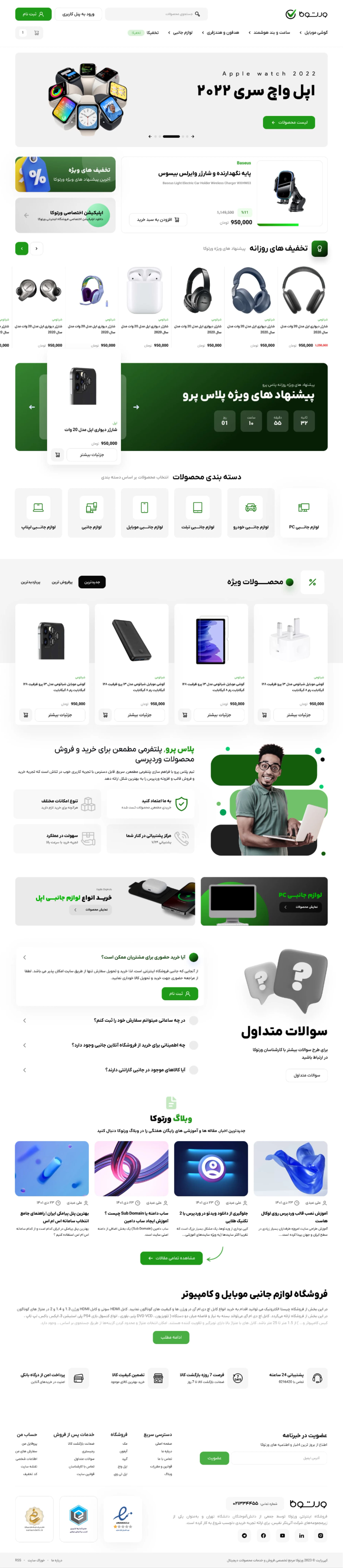
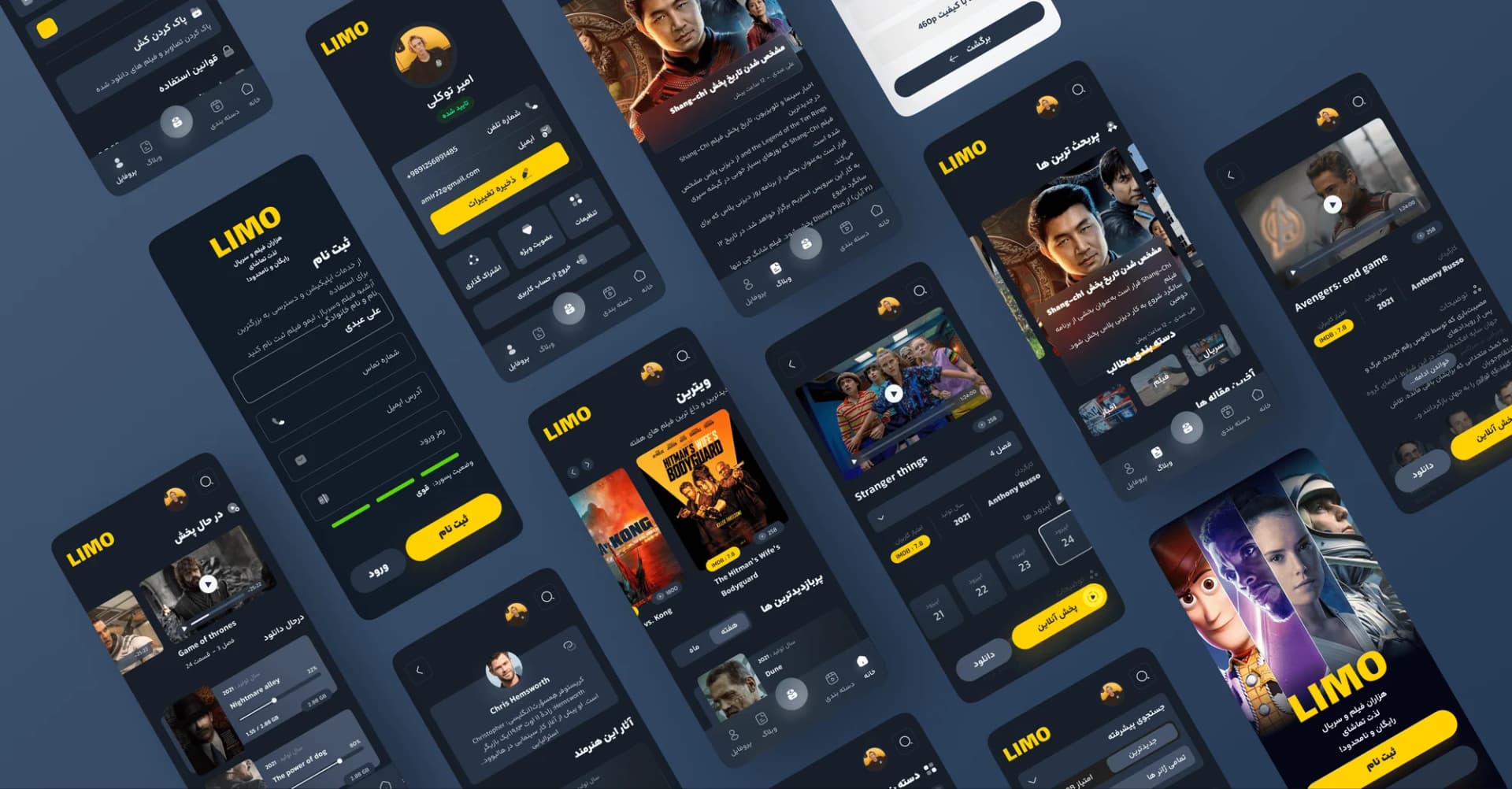
Interface design
These deliver design files and documentation, not a built site. If we implement it too, this stage is credited against the development contract.
What information should you send Niasa to get a proposal?
Send a short brief that makes the problem clear, not a list of screens. The same brief you'd send any other UI design company is enough for us too. Fill in this template:
Product and audience: What are you building, and for whom?
Current problem: Where do users get stuck, or where is the business losing out?
Priority flows: Two or three things users absolutely must be able to do easily.
Design and development status: Do you have an existing design? Is the product live or still being built?
Budget constraints: A range, even a rough one.
Target date and the reason for it: For example, an event, a sales season or a commitment to investors.
User data: Usage stats, support calls or survey results, if you have them.
Decision-maker and technical constraints: Who makes the final call, and what constraints does the development team work under?
If the scope isn't clear yet, say so honestly. A long list of guessed screens doesn't help; an explanation of the problem does. Quite often, clarifying the scope is itself the first part of the work.
When outsourcing UI design, leave sensitive customer information and financial data out of your first message. Share samples and any necessary access after a confidentiality agreement is in place, because until then there's no commitment between you and the team.
At Niasa's UI/UX design services, we start from exactly this kind of brief. We read it, ask about the gaps and define the scope of work together with you. If you're ready, send us your project brief and we'll go through the scope with you.
Even if you're talking to several teams at once, set your table weights today and send the same brief to all of them. A fair comparison is only possible when everyone has answered the same question.
شرح محصول، مسیرهای اولویتدار و محدودیتهایتان را بفرستید تا امکان و دامنه همکاری طراحی با نیاسا بررسی شود.
Frequently asked
4How do you find the best UI design company?
Start with teams that can explain a problem close to yours, backed by evidence. Ask each one to walk you through an interactive flow and explain why it made its decisions. Neither the number of portfolio pieces nor the look of the company's website is enough on its own.
Is a freelancer a better choice for a small project?
An individual specialist can be a good fit if the scope is clear and you have the capacity to manage feedback and coordinate with the developer. When you need several skills or sustained capacity, team structure and a named backup owner matter more.
Can design start without user research?
You can start with the information you already have and written-down assumptions, but that doesn't remove the uncertainty. Identify which high-risk decisions need to be checked with users before development begins.
Does a Figma file handoff include development?
No. Design files and interactive prototypes usually aren't the final, usable product. Coding, connecting to data and quality control of the built version should be defined separately in the scope of work.