



You've received two quotes for the same product, and the numbers are far apart. What isn't obvious is where that gap in UI design cost comes from. The short answer is to stop counting pages. Line up the design scope, the complexity of the user flows and the deliverables side by side. The cheaper quote may simply leave out part of the work you need.
What does UI design cost depend on?
Several factors combine to set UI design cost. The first is volume: the number of distinct templates, the states each screen has and the user flows. The second is depth: how much research is involved, whether there are mobile and desktop versions, and which shared components and deliverables you get. Revision rounds, user testing and design support during implementation should also be spelled out separately. That's why page count alone isn't enough to compare prices.
The user interface (UI) is how the product looks and the controls people use, from the buy button to the sign-up form. User experience (UX) is about the quality of the path a user takes to get something done. Does a shopper understand the shipping terms before paying, or get caught off guard halfway through checkout?
One more boundary needs to be clear: design isn't coding. A designer defines the structure, the look and the expected behavior, and the development team turns that into a working product. So UI design cost doesn't automatically cover connecting a payment gateway or building user accounts.
If the line between these activities still feels fuzzy, our guide on the difference between UI and UX for businesses will help. When you request an estimate, say plainly whether you want design only, development only, or both with separate pricing.
How is UI design cost calculated?
The formula is simple. Multiply the time for each agreed activity by that activity's rate, add up all the lines, then add any direct costs you've approved. If activities carry different rates, calculate each line separately. In a fixed-price proposal, though, the amount rests on the scope and the assumptions you've agreed on.
Before you ask for a number, work through the estimate in this order:
Write down the product's goal and the user's main flow.
List the distinct templates.
Specify states, devices and languages.
Decide on research and testing activities.
Record the deliverable for each phase and its acceptance criteria.
An acceptance criterion is a condition that, once met, means you sign off on the deliverable. “The booking form must include a fully-booked state and a connection-error state” can be checked. Anyone who opens the file can see whether those two states are there. “The design should look professional” isn't enough, because everyone has their own idea of professional.
You can copy the sheet below and log your UI design cost line by line. Fill in the number cells after you've agreed with the design team, because a number without its assumptions next to it means very little.
Activity | Unit or quantity | Estimated time | Rate | Amount | Assumptions |
|---|---|---|---|---|---|
Initial research | Access to users | ||||
Designing templates and states | Scope list | ||||
Revisions | Consolidated feedback | ||||
Development support | Review scope | ||||
Direct costs | Approval before purchase |
There's one exception. If a flow is still unclear, don't ask for a firm UI design cost for it. Limit the initial discovery to a few specific questions and deliverables first, then estimate the rest. Read any UI design rate card together with its validity date, its scope and sign-off from whoever handles sales.
Pages, templates and states: what's the difference in an estimate?
Proposals often use these three words as if they meant the same thing, but they don't. A page is a specific destination. A template is a structure that repeats many times. A state is how that page looks at a particular moment. The detail page for one particular product is a destination. The structure shared by all product detail pages is a template, and loading, error and out-of-stock are its states.
Imagine a store with hundreds of products. They may all use a single product detail template, because changing the product name and photo doesn't call for a separate design. But if shoppers pick color, size and delivery time together on some products, that page probably needs a different structure and behavior.
My rule for separating templates is simple: does the user make a genuinely different decision or interaction on this page? If only the content changes, don't estimate UI design cost by counting the site's URLs. If the layout or the selection logic changes, write that difference explicitly into the scope.
When you review the price per UI page, ask the team these questions:
Is the pricing unit a standalone page or a reusable template?
Are empty, error and loading states included in the price?
Are modals and confirmation messages included?
Is the mobile version part of the same unit, or a separate line?
Don't blindly multiply the number of templates by the number of states and devices, though. A shared error message may appear in several flows and only need designing once. On the other hand, turning a desktop table into mobile cards can need a design of its own. Count the shared parts once and describe the differences separately.
The share of research, wireframes, prototypes and final design
Research reduces uncertainty about what users need and how they behave. A wireframe is a simple sketch of a page's structure. It shows where sections go and which information comes first, without full visual detail. A prototype is an interactive mock-up that shows movement between screens, so the flow can be reviewed or tested with users.
When you estimate UX design cost, the name of an activity tells you little, so ask what usable output it produces. The first question I usually ask about a “user research” line is which question it's supposed to answer. Do users need to compare providers before choosing an appointment, for instance? The answer to that one question can change the order of the entire booking flow.
Research: the question, the method, and a finding that affects a design decision.
Wireframe: content structure, information priority and the path to completing a task.
Prototype: the flows you can click through and the range of behavior simulated.
Testing: observed issues, fix priorities and the next decision.
Don't assume research is a fixed percentage of UI design cost either. How deep it goes depends on what you already know and how risky the main flow is. Redesigning a familiar contact form isn't the same as designing an unfamiliar flow for a financial application. When a flow is unclear, skipping research may look like a saving, but it can lead to restructuring the design later.
A question left unanswered before design usually costs more to answer in the middle of the build.
Final design locks down color, typography, spacing and component states. It should be clear how a disabled button, an input error and a selected option behave. Ask for the editable file and notes on interactions too. A handful of beautiful images isn't enough to build a product accurately. It forces the developer to guess at the gaps.
How mobile, right-to-left and a design system affect the budget
Responsive design means the layout adapts to the screen size. But mobile isn't a shrunken desktop. On a narrow screen, content priority, the placement of controls and the way tables are displayed may all change. Those differences feed into UI design cost.
When you review the price of website UI design, look separately at tables, long forms and the mobile menu. These usually need fresh work on mobile. Write down how many screen sizes will be delivered and how the page behaves between them. For example, specify whether a table scrolls horizontally on a narrow screen or turns into cards.
Right-to-left isn't just text starting from the other side. When a language like Persian or Arabic shares a line with a number, an email address or an ID, the reading order can get scrambled. Mirroring every icon isn't the answer either. A back arrow should flip, but a video play icon shouldn't. For pinning down multilingual requirements, the web internationalization guidelines are a useful additional reference.
Accessibility also needs to be clearly in scope. It means people with different abilities and tools can use the product. Text legibility, color contrast and the keyboard focus indicator all require design decisions. The focus indicator is the outline that shows which element a user has reached with the Tab key. To set the level of review, see the web accessibility standards guidelines. Design alone can't guarantee the final product complies, though, because part of that is built in code.
A design system is a set of reusable components plus rules for where and how to use each one. A small library of buttons and forms isn't the same scope as an extensive system for a multi-team product. My advice is to decide the level of documentation and who will maintain it before estimating. A system without an owner gradually falls behind the real product.
For app UI design cost, differences in interaction patterns between operating systems and offline states also count. Still, two platforms don't necessarily mean twice the design. Usually some components stay shared and only the differences get designed separately. To work out which differences you need, our guide to UI and UX design principles for mobile apps helps you shape the scope.
Hourly, per-page or per-project pricing: what's the difference?
The hourly model is based on time worked, the per-page model on a unit of design, and the project model on an agreed scope. Which suits you better? That depends on how settled your requirements are, not just on what the team prefers.
Model | Good fit for | Condition for budget control |
|---|---|---|
Hourly | Changing scope or step-by-step discovery | Activity reports, a cost cap and review points |
Per page | Comparable, countable templates | A clear definition of the unit, its states and its complexity |
Per project | Clear scope and defined deliverables | Acceptance criteria and a change-management process |
A lower hourly rate doesn't necessarily reduce the overall UI design cost. Look at the time required, the quality of the output and the amount of rework alongside the rate. A team with a lower rate might need more hours. In the hourly model, also agree on when the team will warn you that you're approaching the budget cap.
Per-page pricing makes sense for similar pages. An interactive report page with filters and charts still isn't equivalent to a text-heavy about page. A project model doesn't mean every change gets accepted without review, either. If the main flow changes after sign-off, the way it gets re-estimated should already be agreed.
That's why a hybrid model is sometimes the more sensible choice. Start with a limited discovery phase, then get a project proposal for the scope that has become clear. This separates the early uncertainty from any commitment to building the whole product.
When comparing UI/UX design prices, look at the total separately from the payment schedule. Make the phased delivery clear as well: which deliverable, approved by whom, opens the next phase? A smaller upfront payment on its own isn't a sign of a better proposal.
Three sample scenarios with a defined scope
These scenarios are entirely hypothetical and only show how to write a scope. You can't rank UI design cost by product type. A form on a services website can easily be more complex than a store's checkout flow.
Services website: The scope covers the home page, the services list, the service detail page and the contact form. Mobile and desktop design, the form's error and success states and an editable file are among the deliverables. Content writing and coding are out of scope.
Shared components: a lightweight library of buttons, inputs and service cards.
Testing: finding the right service and submitting the contact form.
Revisions: consolidated feedback logged against a specific version of each template.
Now suppose each service has its own form. A consultation request might need a document upload field while the others don't. At that point “contact form” no longer describes the scope properly. Add the rules for which fields appear where before you get the estimate.
Online store: The scope covers product listings, product details, the cart and guest checkout. Out-of-stock, empty-cart and failed-payment states are needed too. An interactive checkout prototype is part of the output, but the admin panel and payment integration are out of scope.
Shared components: quantity control, price display, product card and variant selection.
Testing: guest checkout and getting back on track after a failed payment.
Revisions: issues logged by checkout step and prioritized by their effect on order completion.
Guest checkout isn't the same as a full user account. Order history and returns can each be a scope of their own, so if you need them, name them separately.
Booking app: The scope covers search, time selection and booking management. Fully booked, lost connection and cancellation also need designs. Research on the booking flow and on platform differences is in scope. Development and the provider panel stay outside it.
Shared components: calendar, selectable time slots and booking status.
Testing: booking an appointment and retrying after a lost connection.
Revisions: a record of the decision behind each change and its effect on the other booking steps.
Revisions, testing and costs outside the agreement
A revision round is one batch of consolidated feedback on a specific deliverable. The number of rounds means little until you define the deliverable and who collects the feedback. You probably know the scene. The sales manager gives one note, the CEO gives a different one a few days later, and a phase that was already approved gets reopened.
Keep fixes for gaps in the agreed scope separate from new requests. If an error state was listed in the scope but isn't in the file, asking for it isn't a new feature request. Adding phone-number login after the email login flow has been approved may well be a scope change.
Usability testing means watching someone complete a specific task. You might ask a participant to book an appointment for the weekend and see where they hesitate. That's different from reviewing how a page looks or checking that the code works. In a UI design cost proposal, spell out the goal of the test, the type of participants and what the report will contain.
Who recruits participants and schedules sessions?
Who supplies the copy, images and paid assets such as fonts or photos?
What are the terms for extra meetings?
How many rounds of implementation review are included, and what do they cover?
When the scope changes, put the request in writing first. The team should explain the effect on cost and timeline, and work should start only after you approve it. Not every piece of feedback costs extra, though. Sometimes a new feature can replace a lower-priority section that gets dropped.
The best time to draw the line on commitments is before the first disagreement.
Timelines aren't only in the design team's hands. They also depend on content being ready, access to users and how quickly the decision-maker responds. Record feedback deadlines and what happens when they slip. Approving a structure with placeholder text also doesn't mean accepting any volume of content later. If each service description grows from two lines to two paragraphs, the layout may have to change.
How do you compare two quotes?
Send the same scope to both teams, and compare totals only after the deliverables are like for like. Mark anything unclear as “needs clarification”, not as zero. If a proposal says nothing about the mobile version, that's ambiguity. It doesn't mean mobile is free, and it doesn't mean it's definitely excluded.
Picture two hypothetical proposals side by side. The first just says “design of store pages”. The second lists the templates, checkout states, interactive prototype and delivery files one by one. The second is easier to evaluate, but you still can't judge whether either one is good value.
Point of comparison | General proposal | Itemized proposal |
|---|---|---|
Templates and states | Needs clarification | A list you can match against the scope |
Research and testing | Needs clarification | Defined activities and outputs |
Versions and revisions | Needs clarification | Defined devices and rounds |
Delivery and development support | Needs clarification | File type and review scope |
More detail isn't enough on its own, though. A detailed proposal may include activities your product doesn't need at its current stage. Tie each line to the project goal and ask what you'd lose if it were removed. An extensive design system for a small brochure site, for example, may only add maintenance costs you don't need.
Before you choose, settle file ownership, access levels and whether you can edit the files after the engagement ends. Name the approver and agree on feedback deadlines and acceptance criteria. In my view, a tidy design file with clear naming and documented behavior is worth as much to the development team as the final visuals. If a developer can't find what a disabled button looks like in the file, part of the design hasn't been delivered.
So when you compare UI design cost, find the difference in scope first and only then look at the difference in price. To put these agreements on paper, our guide to recording commitments in a website design contract helps you set up the working clauses.
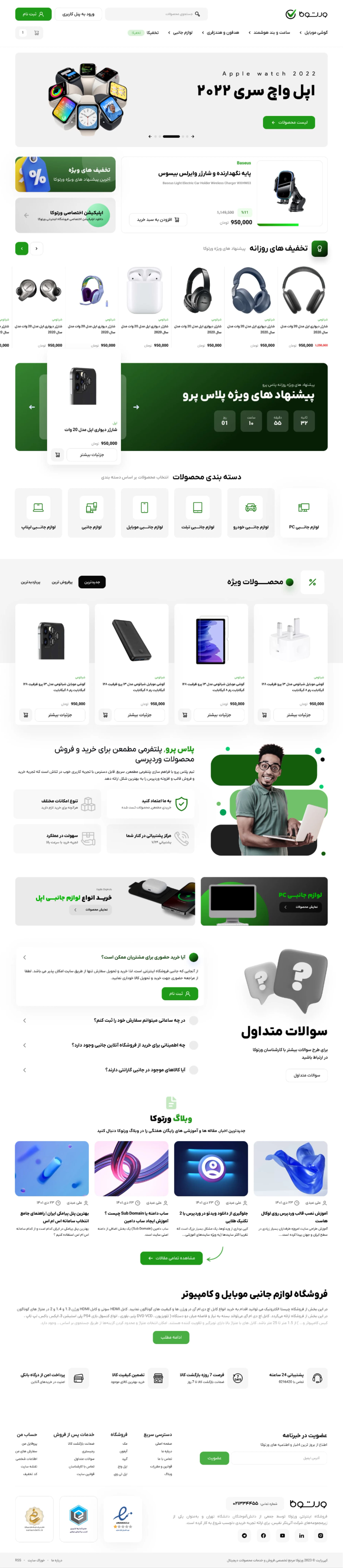
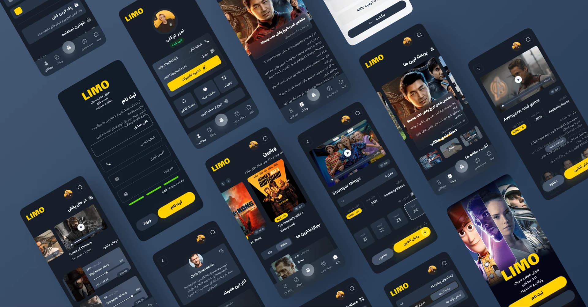
Interface design
These deliver design files and documentation, not a built site. If we implement it too, this stage is credited against the development contract.
Niasa's current price table and what we need for an estimate
You'll find current prices in Niasa's UI/UX design pricing and services table. Read each package's price together with its assumptions and scope. A project with different flows, research needs or deliverables needs its own estimate.
If you're considering working with Niasa, turn your product description into a list of tasks that can be agreed on. Price is only one part of a proposal. Research, design, revisions and delivery each need a clear scope too. This template gathers everything we need for an estimate in one place:
Product type and goal: website, app or enterprise software, plus the main task that should become easier.
Users and roles: who uses the product, and what access do they have?
Key flows: such as sign-up, purchase, booking or request approval.
Templates and states: the known list, including errors and special states.
Devices and languages: mobile, desktop, platforms and any right-to-left needs.
Existing files: brand identity, ready content, previous designs and usable data.
Desired output: editable file, interactive prototype, shared components and development support.
Constraints: budget range, timing needs and the reason behind them.
Wherever you don't know something, say so plainly. You can start the conversation without a complete list. As a next step, fill in this sheet and separate the must-haves from the options that can wait. That split gives you a clearer basis for the estimate and for negotiating scope. Both sides know from the start which part goes first if the budget runs short.
مسیرهای اصلی، دستگاههای هدف و فایلهای موجود را بفرستید تا گفتوگو درباره دامنه طراحی و بودجه از اطلاعات مشخص شروع شود.
Frequently asked
4Is there a fixed rate for UI design?
A single figure with no defined deliverables isn't a reliable benchmark. Read each team's rates alongside their assumptions, and check whether research, the mobile version and revisions are included in that figure or billed separately.
How is the price per UI page determined?
First, be clear whether a “page” means a standalone structure or a variation of a repeating template. A multi-step form and a simple intro page aren't the same amount of work, even if both are counted as one page.
Does UI/UX design cost include development?
Only if development is explicitly listed in the proposal. Design files and a clickable prototype aren't a working product. Connecting data or payments requires a separate development agreement.
How can we lower our UI design budget?
Keep the essential flows for the first version and push lower-priority features to later. Reusing shared components and consolidating feedback is usually a lower-risk choice than cutting error states or skipping a review of the main flow.