What is a micro-interaction?
The part micro-interactions play in app design
How micro-interactions improve user retention
The common kinds of micro-interaction in apps
The principles of designing effective micro-interactions
Examples of successful micro-interactions
The part micro-interactions play in modern UI/UX design
In designing an app, many small details do not catch the eye at first, and yet it is exactly those details that make or break the user's experience. Among the hundreds of decisions taken in the design process, there are some very small interactions that may last only a few seconds but leave a lasting mark on a user's behaviour. These small interactions, known as micro-interactions, sit at precisely those delicate points.
From a button's brief shake when a password is entered wrongly to an icon changing colour after something is liked, micro-interactions mediate between a user's behaviour and the system's response. These tiny interactions not only give an app life and responsiveness, they also convey to the user a sense of being seen, understood and guided — qualities that in the end lead to better user retention. In this article we look closely at what a micro-interaction is, review how they are used in app design, and show how designing these small details properly can play a key part in keeping users.
What is a micro-interaction?
A micro-interaction is a very small, brief exchange between a user and a system whose purpose is to convey a response, guide behaviour, or confirm an action. These exchanges may last only a fraction of a second, but they play an important part in the communication between system and person.
Technically, every micro-interaction usually has four main parts:
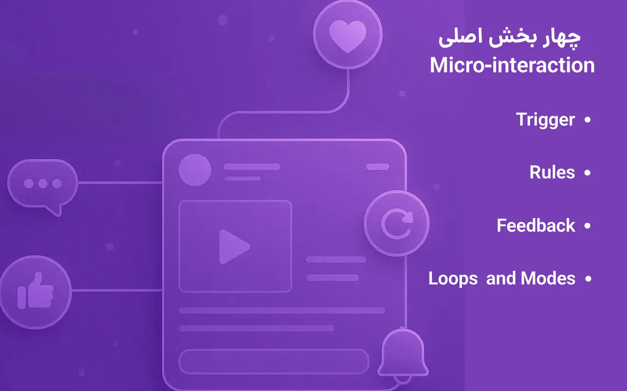
Trigger: the event that sets the micro-interaction off. It may be an action by the user (clicking a button, say) or a system event (a load finishing).
Rules: the logic that settles how the micro-interaction behaves once it has been set off.
Feedback: the response shown to the user — a change of colour, a vibration or a short message.
Loops and modes: how the micro-interaction repeats or changes its behaviour over time or in particular circumstances.
The important point in designing a micro-interaction is that, unlike larger interface elements, these exchanges do not draw attention to themselves. They work in the background and usually appear at the moments when a user most needs guidance or confirmation. That difference is what sets a micro-interaction apart from the other parts of the user experience: its purpose is not to convey content but to build a momentary, responsive, felt connection.
The part micro-interactions play in app design
In designing a modern app, micro-interactions are present in almost every key part, even if the user does not consciously notice them. From the moment a user enters an app to the moment they do something in it, a set of these small interactions accompanies them.
Common examples of micro-interactions in app design are:
Clickable buttons that change colour or state on touch
Forms that shake or show an error message when invalid data is entered
Short notifications confirming that an operation has succeeded
Intelligent loading states with an animation or messages in a human tone
Transitions between screens, or swipes accompanied by visual feedback
The main purpose of these tiny interactions is to make an app feel alive and intelligent. The user should feel that the system "understands them", responds to them, and is not leaving them alone as they go.
That sense of responsiveness helps build trust and confidence. When a user finds that every action of theirs is met with a precise and appropriate response, their mental picture of the app moves towards professionalism, precision and credibility.
How micro-interactions improve user retention
One of the main concerns in professional app design is the retention rate. A great many users install an app, but only a limited percentage of them carry on using it. Micro-interactions, small as they are, play a vital part at exactly this point. First, they give the user a smooth, frictionless experience. When a user meets an error, for instance, rather than silence or a complete halt, a simple, understandable message appears. Design of this kind reduces tension, increases satisfaction and keeps the user feeling in control.
Effective micro-interactions also convey a kind of visual pleasure and a sense that the system is answering. That experience may be brief, but it stays in the user's emotional memory — the very place where the decision to use an app again, or to leave it, is taken. These interactions also reduce errors and improve the user's understanding of what the app is doing at that moment. When a user knows what is happening, the chance of them becoming frustrated or confused falls — and that in itself is one of the most important factors in sustaining engagement.
In the end, micro-interactions can lead to a kind of behavioural loyalty. When a user feels that every click, every swipe and every response is handled smoothly and carefully, they are more likely to come back to the app — not because of any particular feature, but because of what that experience made them feel.
The common kinds of micro-interaction in apps
Micro-interactions in apps cover a wide range of small but effective uses. Each sits at a point in the user's path where silence or inattention from the system could lead to confusion or dissatisfaction. Below are some of the most common kinds:
Changes of button state: the bookmark or heart icon changing colour once selected, for instance. This kind of micro-interaction confirms that an action has been carried out simply, with no need for a written message.
Success or error animations: a green tick, a button turning gently, or a form shaking when something is wrong are all interactions that tell the user the result of an operation.
Pull to refresh: this simple behaviour, which has become something of an interaction standard in many apps, is a classic example of a useful micro-interaction.
Momentary notifications: small messages telling the user that data was saved, that a connection was made, or that the action they wanted has succeeded.
Custom progress indicators: rather than plain loading bars, using light, purposeful animation to show the state of an operation can create a sense of transparency and make the wait easier to bear.

The principles of designing effective micro-interactions
Simple as it looks, designing micro-interactions takes a precise understanding of user behaviour and attention to detail. For these interactions to be genuinely effective, certain principles have to be observed:
Simplicity and purpose: a micro-interaction should be designed to serve a particular need. Overdone animation or complicated effects are not only of no help, they can become an irritation or make things feel slow.
Accord with the brand's identity: the tone, the colour, the movement and the way it appears should match the app's visual language. Micro-interactions that do not fit make the user's experience feel disjointed.
Care over speed and delay: animations should not be long or slow. Timing the start, the peak and the end of each tiny interaction precisely is what separates a professional experience from an ineffective effect.
Testing with real users: how someone reacts to a micro-interaction depends greatly on how they feel at that moment. What appeals to a designer may be ineffective, or even irritating, in a real user's experience. Testing before release is therefore essential.
Examples of successful micro-interactions
In many successful apps, micro-interactions are defined as an inseparable part of the user experience, not a decorative addition. Below are a few notable examples:
Instagram: when a post is liked, a heart appears at the centre with a smooth effect. That short animation conveys a sense of success and emphasises the emotional side of the interaction.
Duolingo: in this language-learning app, the user is encouraged with small but varied sound and visual effects at every correct answer or completed stage. These tiny interactions play a key part in creating the motivation to carry on.
Snapp (in its newer versions): after a trip is booked or a driver's status changes, short notifications accompanied by a vibration or a brief animation create an active, transparent experience — an example of micro-interactions used well in Iranian service apps.
These examples show that carefully designed micro-interactions can create an experience that is multi-layered, natural and conducive to loyalty.
The part micro-interactions play in modern UI/UX design
In the design trends of 2025, attention to behavioural detail has come to the fore more than ever. Micro-interactions not only accord with that approach, they are among the pillars of a rich, human and purposeful experience. Strategically, tiny interactions have become an important part of designing a user experience — a tool for holding an "effective dialogue" between system and person in short, telling moments. These details are where the difference between a merely functional app and a well-designed one shows itself.
More important still, in many projects micro-interactions can be improved without redesigning the whole app. Adding or refining these elements is one of the quickest and most effective ways of improving a user experience, particularly in new versions or in a staged redesign.
In summary
Small as they are in appearance, micro-interactions play a key part in an app's emotional and behavioural structure. From strengthening a sense of control and trust to improving how well the system's behaviour is understood, these interactions leave a lasting mark on the experience a user has of an app. In professional app design, visual appearance alone is not enough; details such as immediate feedback, how buttons behave, confirming animations and simple but timely messages all form part of a digital product's practical identity. In many projects, improving these tiny interactions has raised the retention rate and taken the overall experience to a higher level. It is therefore worth treating micro-interaction design not as a secondary stage but as a serious part of the design process.