
The key information in the header: the first point of contact with a user
The services or products section: a way of guiding users quickly
The trust-building section: reviews, past clients and certifications
Showing the key actions (call to action): guiding a user towards the goal
Responsive design: why optimising for different devices matters
Page load speed: how it affects the user experience and a site's ranking
The search bar and filters: reaching content quickly
Examples of successful home pages on the Persian and international web
A website's home page is the first point at which many users meet your brand, your product or your services. In today's digital world, users spend only a few seconds deciding whether to stay on your website or leave it. In those few seconds, the visual content, the first message, the arrangement of the layout and the way information is presented on the home page play a decisive part in building trust, holding attention and guiding the user. Contrary to the general assumption, a home page is not merely a place to show basic information; it is your brand's digital shop window. If that window is not designed to be orderly, appealing, practical and intelligent, a great many opportunities to communicate and to do business will be lost. In this article we take a careful, practical look at what information, what structure and what design should be on a home page so that it can have the greatest effect on an audience and guide them properly along the path you intend.
A home page is like the entrance to a physical shop: the place where a first impression is formed and where the user's route is set. Its main purpose is to give a clear, coherent and appealing picture of a brand's identity and of the website's purpose. In the least possible time, the page has to show a user where they are, what services or products are on offer and what they should do next. A home page is not only an entrance; it is a visual, interactive guide to the whole website. Designing it properly reduces users' confusion, improves their experience and makes commercial goals more attainable.
The key information in the header: the first point of contact with a user
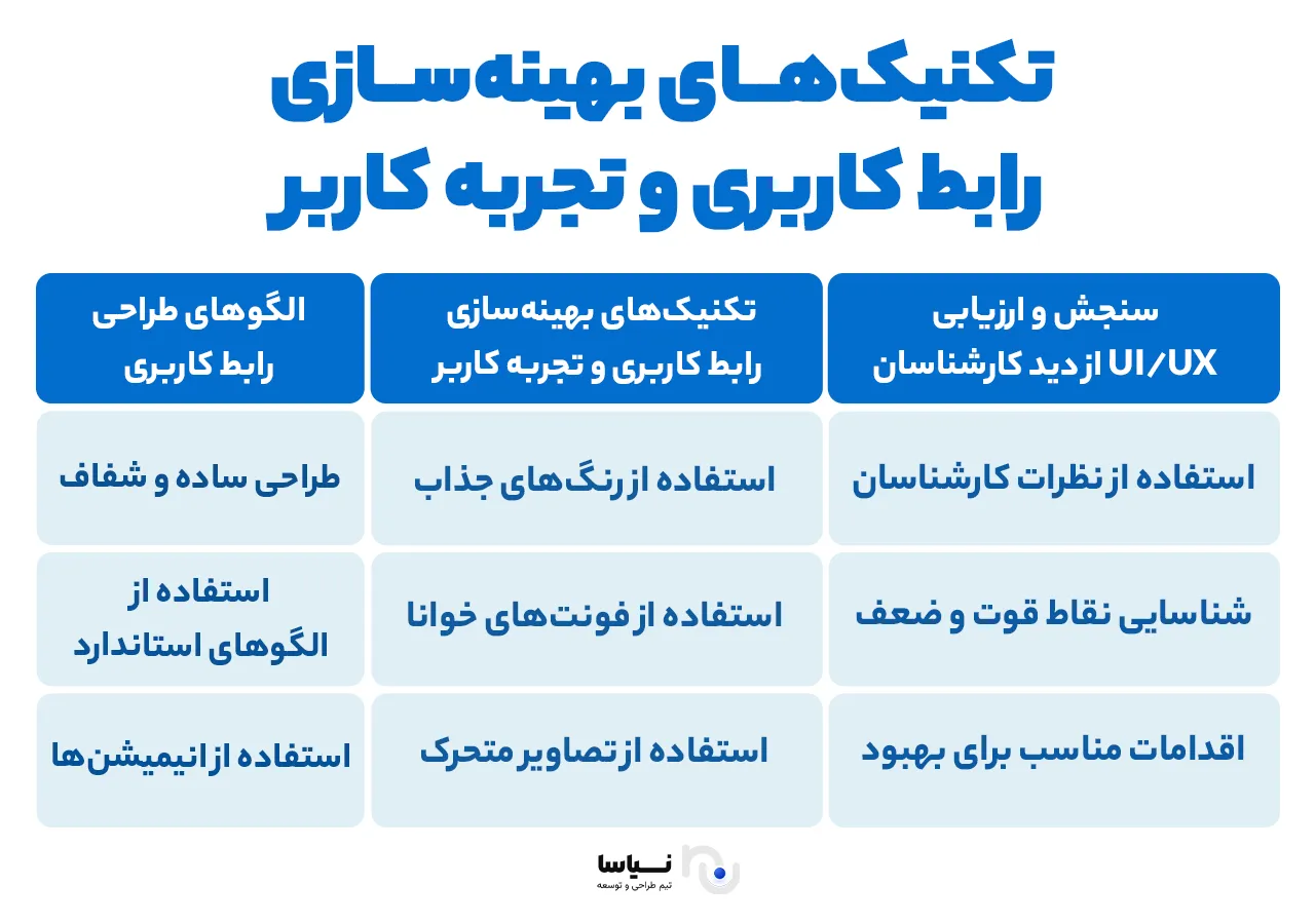
As the top and always-reachable part of a page, the header is one of the most important parts of a home page's design. It plays an important part visually in creating a first impression, but it also has to be functional and interactive. Many users decide on the basis of what they see in the header before they even scroll; the design and content of this part therefore have to be handled carefully and intelligently.
The most important information and elements to show in a header are:
Logo and branding: your logo is the symbol of your brand's identity. It usually sits in the top corner — on the right in Persian, on the left in English. The logo should link to the home page and be of high visual quality.
The main navigation menu: The main menu should present a clear set of the site's key sections: services, products, about us, contact, blog and so on. It should be simple, understandable and responsive, so that it displays well on both mobile and desktop.
Log-in and sign-up buttons (where needed): If your site has user accounts, prominently designed buttons for logging in or signing up should sit in the header.
A search bar: on content or e-commerce sites, search is a key tool for increasing engagement. Quick search with auto-suggest can improve a user's experience considerably.
Quick contact or support icons: if contacting you plays an important part in converting users, icons for a telephone number, WhatsApp or online chat should be visible in the header.
Language or country selection (on a multilingual site): if your site is multilingual, a user should be able to choose the language they want readily from the header.
A header should not be crowded or scattered. Its purpose is to guide a user effectively to the site's main sections and to convey a sense of order and trust. Observing spacing, using appropriate typography and using colours in accord with the brand are all complementary factors in getting a header right.
The services or products section: a way of guiding users quickly
Having caught the user's attention in the hero section, it is the turn of the services or products section, where a user should understand at a glance exactly what this website offers and how they can benefit from it. This part plays a central role in guiding a user to the internal pages and in their deciding quickly.
Why does this section matter?
Users usually come to a website with a particular purpose. If they do not quickly see that your site answers their need, the likelihood of them leaving is very high. Presenting your services or products clearly sets the user's route and strengthens that first trust.
A suggested structure for presenting services or products
Blocks with images or icons: for each service or group of products, design a block or card containing a title, a brief description and a relevant image or icon.
A button to go further, or a secondary CTA: "read more", "details", "buy this product" or "compare services", for instance.
Intelligent categorisation: where the range of products or services is wide, use categories to separate them.
Responsive design: presenting this section in an orderly way on mobile and tablet matters as much as it does on desktop.
Key points in designing this section
Use good-quality, lightweight images.
The introductory text should be simple, practical and free of padding.
Keep colour, typeface and spacing consistent between elements, so as to convey a professional, trustworthy feel.
Always provide internal links to the more detailed product or service pages.
Examples of how to present services or products
If the website belongs to a web design company, it can present its services with icons for "online store design", "corporate website design" and "SEO and optimisation".
An online shop shows its best-selling or newest products in categories.
This section should be like a map guiding a user quickly to their destination on the site — whether that destination is reading further, signing up or buying.
The trust-building section: reviews, past clients and certifications
One of the most effective tools for increasing conversion and building trust in new users is social proof and marks of credibility. The trust-building section usually comes after the services or products on a home page and, by offering customer reviews, the logos of partner brands, satisfaction figures and specialist certifications, plays an important part in visitors' decisions.
Customer testimonials
Showing quotations from real customers who have used your services or products conveys a sense of authenticity and trust to a visitor. These reviews should:
Be brief and understandable.
Come with the name, photograph or company of the person giving them (where possible).
Be shown in a carousel or as cards with an orderly design.
The logos of clients and partner brands
If well-known brands have used your services or work with you, showing their logos in a horizontal row or a simple slider increases a visitor's sense of your site's credibility without their consciously noticing.
Dependable figures
Showing figures for what you have achieved, such as:
The number of satisfied customers ("2,000+ active customers", for instance)
The level of user satisfaction ("95% satisfaction over the past six months")
The number of projects completed or orders fulfilled
These figures have to be precise, up to date and credible; otherwise they will have the opposite effect.
Certifications, awards and standards
If you hold an official certificate or an award from a reputable body (an SSL certificate, ISO, an e-commerce trust mark or an official licence), show it in this section. These can be placed side by side as icons, marks or labels.
Customer testimonial videos (where possible)
Short videos of real customers describing their experience have a greater emotional effect than text. Using them is very effective in particular on service and educational sites.
Honesty and transparency
In presenting the information in this section, avoid exaggeration or fabricated reviews. Users today readily detect dishonesty, and a site's credibility is quickly damaged.
The trust-building section is the bridge that turns a user's hesitation into a final decision to buy or to engage. The more genuine and better documented that bridge, the more confidently a user will come towards you.
Showing the key actions (call to action): guiding a user towards the goal
One of the most important parts of a home page is the call-to-action (CTA) buttons or sections. They play the main part in guiding a user towards a particular action and are in fact the turning point that leads a user to a final conversion — signing up, buying, making contact and so on. The design of these buttons and where they are placed should be settled carefully and according to a website's goals.
Why CTAs matter
CTA buttons are the point at which a connection is made between a visitor and the action you want. Those actions may include buying, requesting advice, asking for a quotation, signing up to a newsletter, downloading an e-book and so on. Well-designed CTA buttons can increase your site's conversion rate sharply.
The qualities of an effective CTA
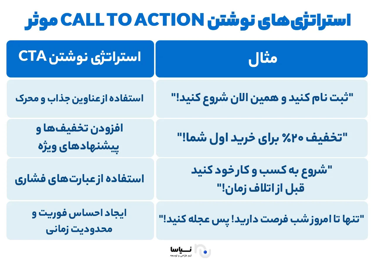
Clarity: the button's text should state exactly what the user will do after clicking it. Phrases such as "sign up now", "buy now" or "get free advice" should be entirely clear and direct.
A strategic position: CTA buttons should sit at the right points on a page, particularly where a user needs to act after reading part of the content or seeing a product. They are usually used in the hero section, after the services are presented, and at the foot of the page.
An appealing design: a button should be designed with a colour, size and shape different from the other elements on the page so as to hold the user's attention. Its colour should accord with the brand's main colours but stand out sufficiently from the background.
Using strong verbs: action verbs such as "get", "start", "buy now" and "see" can create a sense of urgency and interest in a user.
Strategic places for a CTA
In the hero section: the first CTA, after the brand and its value proposition have been presented, should invite the user to act. This button is usually designed to guide a user quickly to the next stage.
Within the content: in every section of the page where further explanation is given or a product is presented, place a CTA to carry the user on.
At the foot of the page: these buttons invite the user to the final action — buying or signing up, for instance.
CTA buttons form the heart of your conversion strategy. If they are well designed and placed in the right positions, they can be the most productive part of your site's home page.
Responsive design: why optimising for different devices matters
As the use of different devices for browsing the web has grown — smartphones, tablets and laptops among them — responsive design has become one of the fundamental pillars of website design. It focuses in particular on adapting a site to different screen sizes so that the user experience is good for everyone on any device.
Why does responsive design matter?
Users today reach the internet from a range of devices. According to global figures, a large percentage of web traffic comes from smartphones and tablets. If your website does not display properly on them, users may quickly leave it. That bears directly on the bounce rate and on the conversion rate.
The qualities of responsive design
Automatic adjustment of a page's content: with responsive design, content changes automatically to suit a device's screen size. Text shown in several columns on a desktop, for instance, will appear in a single readable column on a phone.
Minimalism in the design: on a phone, screen space is limited. Superfluous space is therefore not used, and the design has to focus particularly on the page's main elements (CTAs and important images).
Fast loading: on a mobile device the connection may be slower, so the design has to be such that pages load quickly. That includes optimising images and other resources.
Key points in responsive design
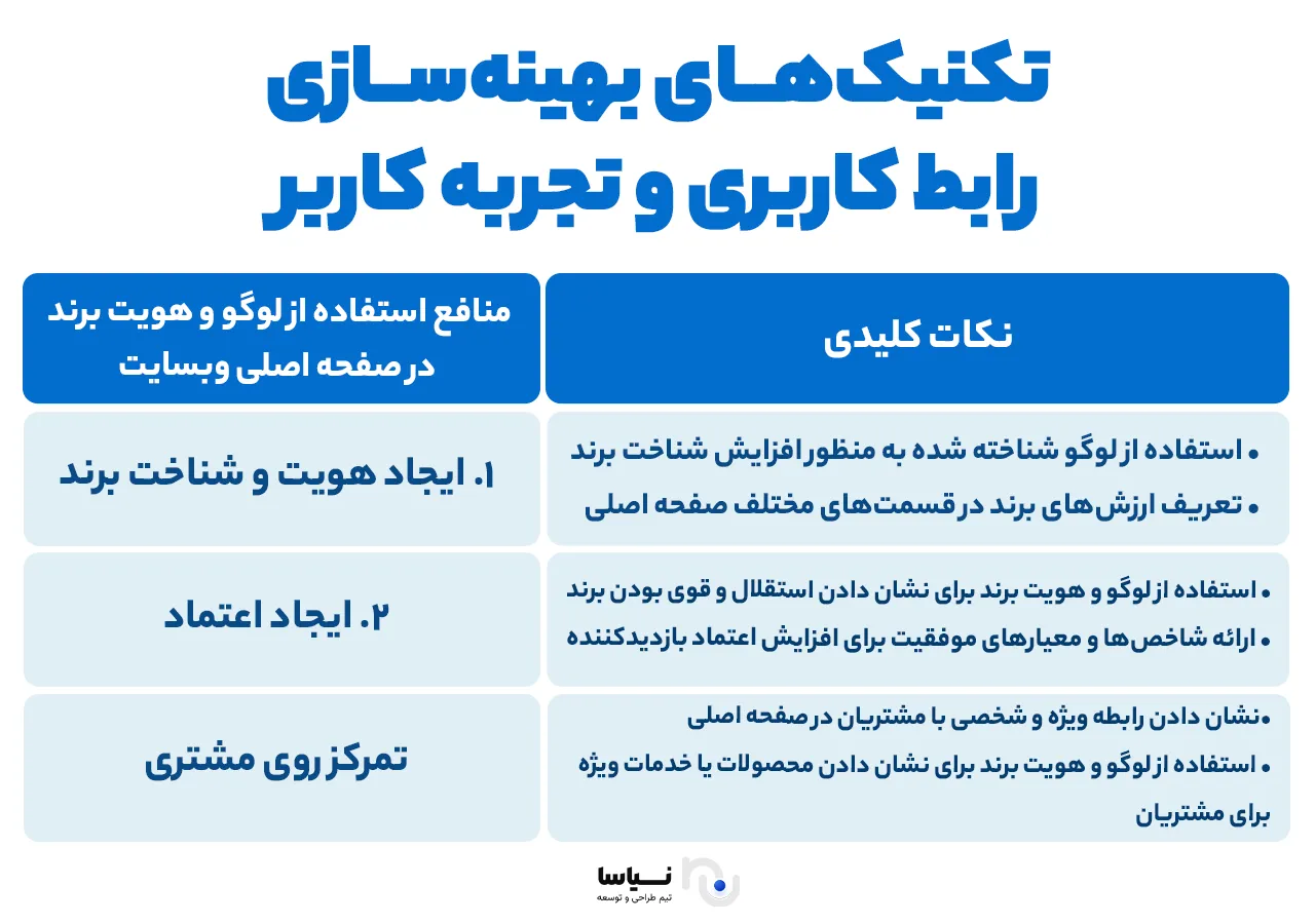
Test across devices: a website's design should be tested on a range of devices, from smartphones to desktop computers, so as to be sure the user experience is excellent on all of them.
Prioritise the content: content should be arranged so that the most important information sits at the top and centre of the page, particularly on mobile devices, where there is less room to show it.
Use responsive frameworks: frameworks such as Bootstrap or Foundation make responsive design simpler and faster and help you optimise your website for a range of devices.
How responsive design affects SEO
Google regards responsive design as one of the important factors in how sites rank in search results. If your site is not optimised for mobile, it will probably rank lower in mobile searches. Responsive design therefore not only helps the user experience, it also improves your site's SEO.
Page load speed: how it affects the user experience and a site's ranking
Page load speed is one of the most important factors affecting the user experience. If a web page takes too long to load, users may leave your site, which not only creates a negative experience but also has a negative effect on how your site ranks in search results.
Why does load speed matter?
According to research, most users expect web pages to load in under 3 seconds. If loading takes longer than that, the likelihood of users leaving increases. That matters even more on mobile devices, because users generally have little patience for pages that take time to load.
Load speed also bears directly on the conversion rate. On an e-commerce site, for instance, every second of delay in loading a page can reduce sales and revenue. Load speed can also have a considerable effect on users' behaviour — on how many pages they visit and on whether they come back to a site.
Points for improving load speed
Compressing images: large images affect load speed considerably. Using the right formats (WebP, for instance) and compressing images without a loss of quality can improve load speed.
Using caching: using browser and server caching to store data and load pages faster on a user's later visits can increase a site's speed.
Using a content delivery network (CDN): to load content faster from different servers, a CDN can help reduce load times considerably across different geographical regions.
Compressing data: using data compression such as Gzip or Brotli to reduce the volume of data sent from the server to users' browsers can reduce page load times.
The search bar and filters: reaching content quickly
The search bar and filters are tools that help users reach the information they want readily and quickly. They matter particularly on large websites with a great deal of content. Search and filters not only improve the user's experience, they can also help increase conversion and hold users' attention.
The search bar: its qualities and why it matters
The search bar is one of the most important elements of any website, letting users reach the content they want quickly without having to browse through page after page. There are several important points in designing one:
The right position: the search bar should sit where it is easy to reach. It usually goes at the top of the page or beside the navigation menu.
Guidance in searching: including search suggestions and autocomplete can make searching faster and more precise. That helps a user reach the content they want more easily.
Precise, fast behaviour: the search bar should present results quickly and precisely. Results should take as little time as possible to load and should be shown in an orderly, logical way.
Precision in searching: you have to be sure that the search engine gives the user precise results for particular searches. That may include searching content, products or particular services.
Filters: making content easier to find
Filters are useful tools that let users narrow search results and see only the content relevant to their needs. They are very useful in particular on sites with a great deal of content or on online shops. In designing good filters, the following points should be borne in mind:
A range of filters: depending on the kind of site, filters should let users narrow results by a range of parameters such as price, category, date, location and so on.
Clarity and simplicity: filters should be designed so that a user can readily find and use them. Placing them where they are easy to reach matters.
Apply buttons: once filters have been selected, there should be a button for applying them. That button should be clearly visible so that the user knows the changes have been applied.
Testing the filters: it is important that filters work properly and show users precise, relevant results. You should gather feedback from users to be sure the filters are working correctly.
Combining the search bar and filters
To create a good user experience, the search bar and the filters should work in step with one another. Users should feel that searching and filtering happen readily and without difficulty. After searching for a particular phrase, for instance, the filters should narrow the results automatically and show the relevant categories. That can reduce search time and help users reach the content they want quickly.
Using advanced filters and categories
On websites with more complicated content, or on online shops with a great many products, advanced filters and logical categories can help users reach what they need faster and more precisely. For instance:
A price filter: on an online shop, a price filter lets a user see products within given price ranges.
A date filter: on news sites or blogs, filtering by date or subject can help users find material relating to a particular date.
Categories: clear, meaningful categories help users move readily between a site's various sections and reach the information they need.
Examples of successful home pages on the Persian and international web
In designing a successful home page, taking inspiration from advanced and successful websites can be very effective. In this section we look at examples of notable domestic and international websites whose key home page elements have held users' attention and increased engagement.
Successful examples from international websites
One of the most notable examples of a successful home page design is Apple's website. With a minimalist design and high-quality images, it holds a user's attention immediately. White space, short and clear text, and bright, appealing CTA buttons guide users towards buying its products. Apple's home page presents its products' strengths effectively and introduces them in a visually appealing way.
With its simple yet appealing design, Airbnb's website has managed to make the most of the user experience. Its home page, with images of beautiful and popular places, encourages users to search for somewhere to stay. The search form sits at the top of the page and the CTA buttons for actions such as "start searching" are very prominent.
One of the largest e-commerce websites in the world is Amazon, whose home page is designed for ease of buying. It effectively puts special offers, discounts and best-selling products in front of users. Amazon's design is simple and practical, and the CTA buttons sit in strategic places to guide users to its various products and services.
Successful examples from Persian websites
One of the successful examples on the Persian web is Digikala. It uses a simple, user-friendly design that makes its various products and services readily reachable. Digikala's home page includes a list of best-selling goods, discounts and special offers that can readily hold users' attention. Its CTA buttons sit in suitable places, and the design of its home page encourages users to buy.
Snapp's website is another successful example of home page design. With a simple, practical design, it guides a user quickly towards its services. A clear design and the use of contrasting colours help the CTA buttons hold attention and encourage a user to take the action intended.
This website, a successful online payment site, has likewise designed its home page effectively so as to win users' trust. Its key home page sections include clear explanations of its services, their advantages and its online payment capabilities. The home page is designed so that a user can readily see and choose between the various payment options.
An analysis of the key, inspiring elements
In these successful websites, the key elements that help attract and keep users are:
A minimalist design and white space: a simple, uncluttered design that keeps users away from crowding and puts their focus on the content and the CTA buttons.
Appealing, good-quality images: high-quality images and appealing graphics can hold a user's attention and encourage them to engage further with a site.
Strategic placement of CTAs: call-to-action buttons should sit in the right positions so that they are easy for a user to reach.
Clear, understandable information: simple, direct language means users quickly understand what they should do.
Conclusion: how to make your home page a strength of your brand
A website's home page is the first thing users see on arriving at your site, and it should therefore be designed strategically. In this article we have examined the various elements of home page design and explained how to refine them so as to hold users' attention and increase engagement. To make a home page a strength of your brand, several key points are essential.
In the end, a website's home page should be designed so that it not only holds users' attention but also encourages them to take purposeful action. With effective design, continuous refinement and a focus on users' needs, a website's home page can be made a strength of a brand and provide a faultless user experience. Bear in mind that refining a home page is only one component of SEO and should go together with the others — link structure and load speed among them — to give the best result in search. You can also visit the link below to order a specialist website design.