The psychology of colour
What choosing a site's colours means
Why choosing the best colour combination matters in web design
Figures on the effect of colour in improving a website
The right colours for e-commerce, corporate, personal, medical and service websites
What is the best colour combination for a website?
Practical ways of choosing a site's colours
What are the specialist tools for choosing a site's colours?
What to bear in mind in choosing a site's background colour
What to bear in mind in choosing a website's text colour
A site's colours and their effect on SEO
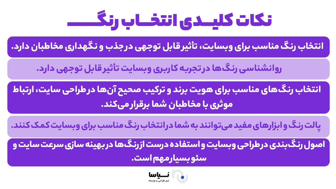
Choosing colour for a website is one of the most fundamental stages of design and bears directly on the user's experience and on how an audience perceives your brand. Colours can stir different feelings and responses in users and can play a key part in whether a website succeeds or fails. To choose the right colour for your website, you first have to consider your brand's identity and the messages you want to convey. Understanding the psychology of colour and the effect of each colour on users' feelings can help you choose the right combination. Matching the colours to the kind of website (e-commerce, corporate, personal, medical or service) and to the target audience also matters particularly. In what follows on the Niasa website, we look more deeply at the psychology of colour, at why choosing the right combination matters, at figures on the effect of colour in improving a website, and at the right colours for different kinds of website. We also set out practical ways of choosing colour and introduce specialist tools for it. Stay with us to become acquainted with the professional points in choosing colour for your website and to provide a better experience for your audience.
The psychology of colour
Colours have different psychological effects on people and can stir different feelings and responses. Understanding those effects can help you choose the right colours for your website. Below we look at some colours and their psychological effects:
Red: the symbol of excitement, energy and urgency. It can hold users' attention and create a sense of urgency.
Blue: conveys trust, calm and professionalism. It is therefore widely used on corporate and financial websites.
Green: associated with nature, health and calm. It is generally used on websites to do with the environment and health.
Yellow: conveys optimism and energy, but overusing it may tire the eye.
Orange: a combination of red's energy and yellow's optimism, and it can be useful for drawing attention to call-to-action (CTA) buttons.
Purple: the symbol of luxury, creativity and spirituality, and it can convey a sense of high quality.
Black: conveys power, elegance and sophistication. It is generally used on luxury and fashion websites.
White: the symbol of simplicity, cleanliness and minimalism, and it helps create open, clean space in a design.
By understanding the psychology of colour, you can choose a suitable combination for your website that accords with your brand's identity and the messages you want to convey.
What choosing a site's colours means
Choosing a site's colours means establishing the right colour palette for a website, one that accords with the brand's identity, the content presented and the target audience. That choice covers the main, secondary and background colours, which together shape the user's experience.
The factors affecting the choice of a site's colours are:
1 – The brand's identity
The colours should accord with your logo, your products and your services so as to create visual coherence.
2 – The target audience
The audience's age, gender, culture and taste all bear on the choice of colours.
3 – The kind of website
E-commerce, corporate, personal, medical and service websites need different colours, ones that suit the kind of content and the site's purpose.
4 – The psychology of colour
Understanding the psychological effects of colour helps in choosing the right combination.
Bearing these factors in mind, you can choose colours that are not only visually appealing but also convey your messages properly. To see the rates for professional web design customised to the colours you want, you can visit the link.
Why choosing the best colour combination matters in web design
Choosing the right colour combination for a website matters in a number of ways:
Reaching and keeping users
Appealing, coherent colours can hold users' attention and encourage them to stay on a site.
A higher conversion rate
The right colours can encourage users to take the action you want (buying, signing up or downloading).
Strengthening the brand's identity
Colours in accord with a brand help build recognition and recall.
A better user experience
The right colours can make navigation easier and make content more readable.
A psychological effect
Colours can stir different feelings and responses in users that bear on their decisions
Figures on the effect of colour in improving a website
Choosing colour for a website bears directly on users' behaviour. Research shows that:
90% of customers' buying decisions are influenced by colour and a website's visual appearance.
85% of users regard colour as the main factor when choosing a product.
66% of consumers leave a website if its colour and design are not appealing.
42% of users are influenced by the colour of call-to-action buttons such as "buy" or "sign up".
Using contrasting colours for a CTA can increase the conversion rate by up to 32%.
These figures show that colour is not merely a matter of beauty; it can improve a site's performance and its rate of engagement.
The right colours for e-commerce, corporate, personal, medical and service websites
In choosing a site's colours, the kind of website has to be borne in mind, because every industry has its own colours that accord with a brand's identity and with users' expectations. Below we look at the right colours for the various kinds of website.
The right colours for an e-commerce site
The suggested colours are:
Red: stirs feeling and increases sales (brands such as Coca-Cola and KFC use it).
Orange: creates a sense of cheerfulness and an urge to buy.
Yellow: holds users' attention and increases a sense of optimism.
Blue: builds trust and confidence in customers (suited to technology and financial shops).
A point: strong colours such as red and orange suit stirring a purchase, but they should not be overused.
The right colours for a corporate website
The suggested colours for a corporate website are:
Dark blue: conveys trust and credibility (brands such as Facebook, LinkedIn and Samsung use it).
Grey: conveys professionalism and stability.
White and black: create simplicity and formality in a brand.
A point: formal and financial companies use gentler colours so as to convey security and strength.
The right colours for a personal site
The suggested colours for a personal website are:
Purple and pink: convey creativity and personality.
Green: creates a sense of calm and of nature.
Pastel colours: suited to personal and artistic blogs.
A point: for a personal site, the colour combination should accord with the individual's personality and identity.
The right colours for a medical website
The suggested colours for a medical website are:
Green: conveys health and life.
Light blue: creates a sense of confidence and calm.
White: the symbol of cleanliness and hygiene.
A point: do not use dark colours on a medical site, because they may create a sense of anxiety.
The right colours for a service website
The suggested colours for a service website are:
Yellow and orange: to hold users' attention and increase engagement.
Blue and green: to build trust and convey professionalism.
Grey and black: for luxury websites and particular services.
A point: the colour combination should be such that it conveys to a user the professionalism of the service.
What is the best colour combination for a website?
The right colour combination for a website depends on how the colours accord with one another and on their effect on users. Here are some of the best colour combinations for a website:
1 – Vista blue, ice blue and yellow
Suits: technology websites, start-ups and finance
Why? Combining two shades of blue creates a sense of trust and calm, and yellow, as a complementary colour, adds energy and liveliness.
2 – Lunar grey and sky blue
Suits: corporate and professional websites
Why? Grey conveys formality and professionalism, and blue increases a sense of trust.
3 – A light colour combination with purple
Suits: creative and artistic websites
Why? Purple conveys creativity, and light colours create a modern, lively space.
4 – A light cream combination
Suits: luxury and minimal websites
Why? Cream and earth colours convey warmth and intimacy and help luxury brands convey elegance.
Practical ways of choosing a site's colours
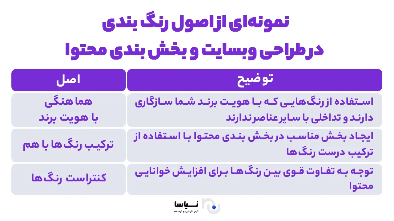
To choose colour for a website, you have to choose colours that accord with your brand's identity. Then use two to four colours in the design so as to avoid visual clutter. Choose the colour of the call-to-action buttons (sign up, buy) to contrast with the background. An important point is to choose colours that are readable for every user, including people with visual impairments. Below are a few practical ways of choosing a website's colours:
1 – Using colour palette sites
Choosing the right colour combination for a website takes care and a knowledge of how colours work together. Fortunately, there are a number of specialist tools and websites that help you find the ideal palette for your brand and your design.
Coolors.co – an excellent tool for finding professional colour combinations
Adobe Color – lets you build and test a palette
Paletton.com – suited to checking how colours work together
2 – Looking at the colours of similar sites in your field
Look at what colours your competitors use. You will then see whether their colour combinations are user-friendly. You can then take inspiration from them, but try to create a distinctive design.
3 – Attention to your audience's characteristics
A website's colours should accord with the taste and characteristics of the target audience. Users' age, gender, culture and psychology all play an important part in choosing the right colours for a better user experience.
Age group:
Younger people prefer energetic, cheerful colours.
Older people prefer gentle, classic colours.
Culture and geography:
Red is a symbol of joy in some countries and a sign of danger in others.
Blue is a calming and trusted colour in many cultures.
What are the specialist tools for choosing a site's colours?
The online tools for choosing colour for a website are:
Material Palette – suited to material design
Khroma – artificial intelligence for choosing colours to your taste
Color Hunt – a set of ready-made colour palettes
What to bear in mind in choosing a site's background colour
A website's background colour has a considerable effect on how readable the text is and on the user's experience. The right colour should be such that it does not tire the eye and accords with the site's content.
Use gentle colours so that the content stays readable.
A background that is too light or too dark tires the eye.
For news and educational sites, a white background is the best choice.
What to bear in mind in choosing a website's text colour
A website's text colour should be chosen so that it makes the text more readable and contrasts properly with the background. Standard colours such as black, dark grey and navy are generally recommended for body text.
The text colour has to contrast with the background so that it is readable.
The standard text colours are black, dark grey and navy.
Do not use very light colours for body text.
A site's colours and their effect on SEO
A website's colours can affect the user's experience and the level of engagement, and those factors play an important part in improving SEO. Using appealing, readable colours reduces the bounce rate and increases the time a user spends on a site.
Sites with a good colour combination have a lower bounce rate.
A better user experience increases the time a user spends on a site.
CTA colours bear directly on the click-through rate (CTR).
In summary
Choosing colour for a website is one of the most important stages of design and bears directly on the user's experience and on the conversion rate. By understanding the psychology of colour, using professional combinations and testing your colours, you can arrive at the best design for your site. With online tools and by observing the principles of accessibility, create a modern, user-friendly design. Now that you have learned all the important points, it is time to choose the right colour for your website.
Frequently asked questions
1 – What is the best colour for my site?
It depends on the kind of site, on your brand and on your audience.
2 – How do we choose a colour scheme for a website?
Use colour palette tools, look at your competitors and test with users.
3 – What does the psychology of colour mean?
Examining the emotional and mental effect of colour on users.
4 – Name a few examples of colours' personalities.
Blue = trust, red = energy, green = calm, yellow = cheerfulness.
5 – What are the web design colour trends in 2024?
Pastel colours, earthy and natural combinations, digital blue.