
In this article we intend to show you how to build a responsive website. We also offer thorough guidance on designing and developing one.
Why responsive sites matter
In this section we look at why responsive sites matter. We should begin by asking why we should think about a site being responsive on a phone and regard it as an essential standard. Broadly, a site being responsive on a phone means a better experience for users. Responsive websites adapt themselves to the changing ways different devices are used. Users can then reach a site readily from any device and get the same experience.
In designing and building a responsive site, a good many things have to be borne in mind: showing controls and content properly on small screens, fast and efficient loading across devices, and a better user experience in every circumstance. Responsive design means users are always satisfied with your website and go on using your services; better SEO and Google rankings are among the advantages of responsive design as well, and we look at them below.
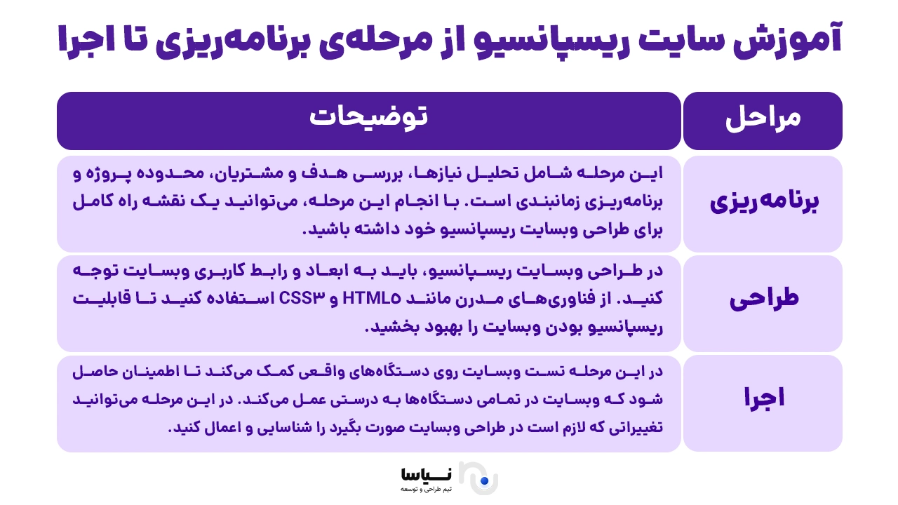
Building a responsive site from planning to execution
In this section we begin with proper planning for building a responsive site. Planning is one of the most important stages in building a website. It takes in analysing needs, examining the aim and the customers, the scope of the project and scheduling. With that stage done, you can have a complete roadmap for designing your responsive website.
We then go on to the stages of designing a responsive website. In designing one, you have to pay attention to the site's dimensions and its interface. Use modern technologies such as HTML5 and CSS3 to improve the site's responsiveness. You should also use the tools you need — graphic and web design software — so that your responsive website appears better to users.
Finally we come to building the responsive website and testing it across devices. Although in designing a responsive website you can use tools such as a mobile simulator, testing it on real devices helps ensure that it works properly on all of them. At this stage you can identify and apply the changes the design needs in order to reach the result you want.
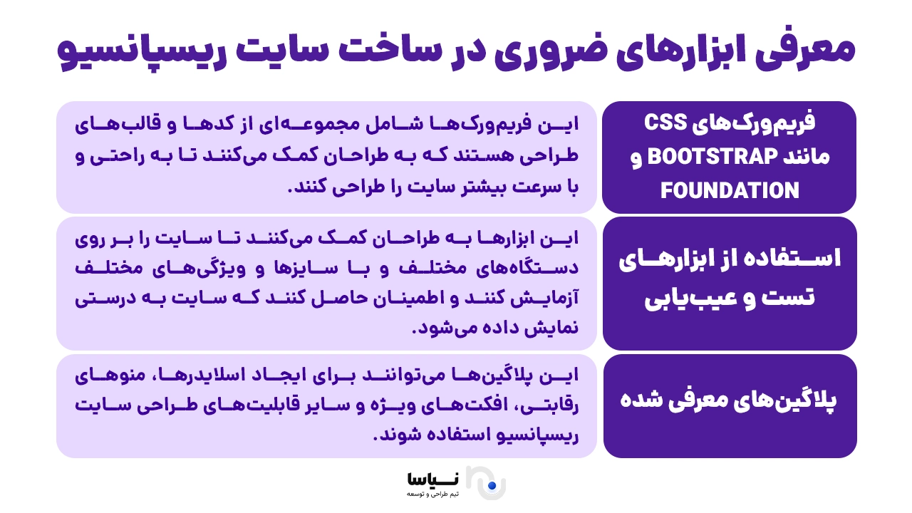
The essential tools for building a responsive site
In designing and building a responsive site, using the right, essential tools is vital. They help designers and developers build sites that display as well as possible across devices and screens, readily and efficiently. In this part of the article we introduce a number of the essential tools for designing a responsive site.
**post@28*/
One of the very useful tools for designing a responsive site is a CSS framework such as Bootstrap or Foundation. These frameworks contain a set of code and design templates that help designers build a site readily and quickly and display it responsively without difficulty.
Using testing and debugging tools while designing and building a responsive site is also vital. They help designers test a site across devices at different sizes and with different characteristics and be sure it displays correctly.
Beyond these, the plugins mentioned are tools that give web designers additional capabilities. They can be used for building sliders, competitive menus, special effects and other capabilities of responsive web design.
With the essential tools set out here, you can readily design high-quality sites that display well on every device and screen. You can also visit the link below to order a professional website design.
How to make images responsive in web design
In responsive web design, designing images carefully and optimising them matters particularly. To ensure images display correctly across devices and screen sizes, modern techniques are used.
One essential technique in designing responsive images is optimising them to reduce file size. Using various tools, you can compress the images on your site and bring them down to a suitable size. That increases the site's load speed and improves users' experience. You can also use newer image formats such as WebP, which is smaller and supports high quality.
Modern techniques can also be effective with responsive images. Rather than using one large image for display on every device, for instance, you can use different versions of the image at sizes suited to each device and, using CSS and HTML, display the right one.