Goals
Agreed with the client before anything was drawn.
- 01Adding to the basket happens without leaving the listing page.
- 02The checkout steps are few and unambiguous.
- 03The filters genuinely help in finding a product.
Design & development studio
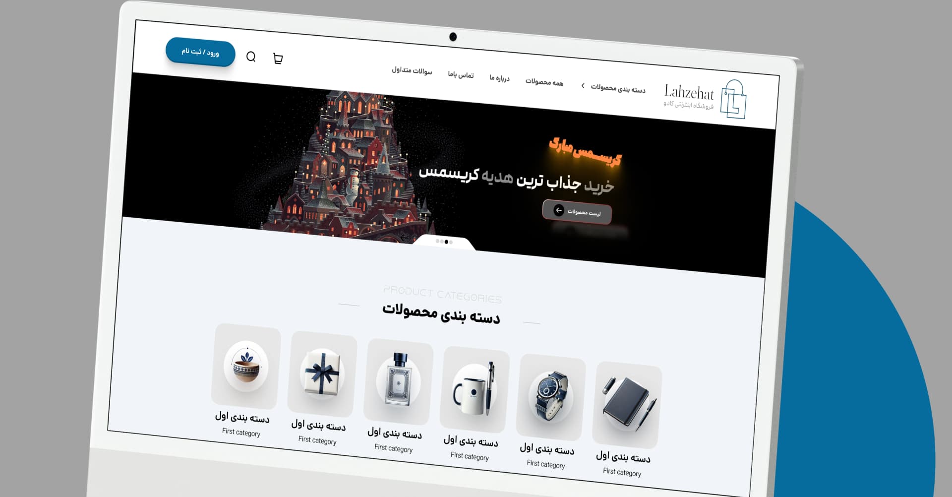
The Lahzehat online store

The numbers that mattered to the client — not the ones that look good.
Agreed with the client before anything was drawn.
Everything that was handed over at the end.
A store with a wide range of products and a small basket; here every extra step in the checkout turns straight into a lost order. The previous version had a long path to purchase.
A catalogue with filters that work, and a shortened path to purchase: adding to the basket without leaving the page, and a checkout that asks only for what it needs.
The product grid was made denser so more of the range is visible at a glance, and the basket became a side drawer rather than a page, so the buyer never loses the thread of browsing.
The things this product does now that it could not do before.
A product goes into the basket from the listing itself, and the basket drawer opens at the side of the page.
With every choice the filters show how many results remain, so a selection never reaches a dead end.
The checkout asks only for what it needs, and errors appear beside the field itself.
Placed, packed and shipped each send their own message.
The route the work actually took, with the time each stage needed.
Following the current path to purchase and finding the step that lost the most people.
The product grid, the basket drawer and the checkout path.
Store setup, payment, SMS and loading the catalogue.
Training the team and watching the first two weeks.
The tools this project stands on, and still runs on today.
The store's own team runs the catalogue and the seasonal campaigns.
A short call, free and without obligation: we listen to what you need, then tell you how long it takes and what it costs.