
Users draw on a range of devices to reach information and services online, from smartphones and tablets to laptops and smartwatches. For that reason, businesses' websites need a particular kind of design that can display effectively on all of them. That is where the idea of responsive web design comes in. This kind of design provides a consistent experience of use that performs as well as possible on every device, from smartphones to large screens.
But why do responsive websites matter this much, and how can they contribute to the success of online businesses? In the rest of this piece on the Niasa website we look at the reasons for and the benefits of designing responsive websites and show why this kind of design has a great many advantages not only for users but for developers and business owners too.

What is a responsive website?
A responsive website (responsive web design) means designing websites that adjust automatically to the screen size of the various devices — mobile phones, tablets, laptops and desktops. The aim of such a design is to provide a well-optimised, consistent experience for users on every device and at every screen size. In the digital age, and given the increasing use of various devices to reach the internet, having a responsive website has become an essential need.
Why should we have a responsive website?
If your website is not responsive, your users' experience may be affected, because the content may not display properly on the various devices. Responsive design lets you present a single website with a well-optimised user experience for every device, without having to build separate versions for different devices.
Designing responsive websites matters a great deal in holding users' attention and improving their experience. When users arrive at a website, they expect its content to load readily and to display in a way suited to their device. If your website is not responsive and users have to scroll a great deal or zoom in to see the content, the likelihood of their leaving the site is high. Responsive design helps a site's content display in an orderly, well-optimised way, without any need to change size or reorient the screen.
The benefits of a responsive website to a business
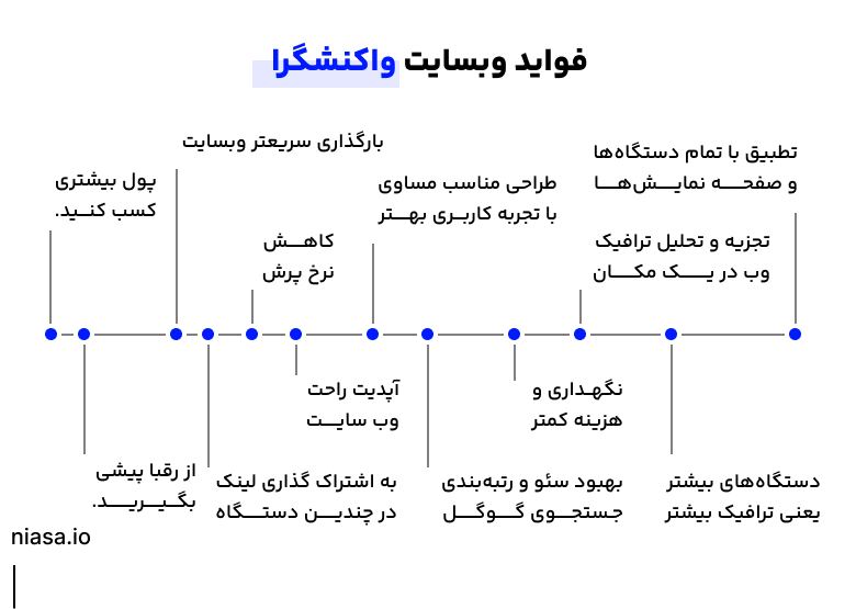
The main advantages of responsive websites to businesses take in the following:

An improved user experience: responsive design means that your website adapts automatically to the screen dimensions of the various devices (mobile, tablet and desktop). That gives users a comfortable, untroubled experience on whatever device they are using.
Greater traffic to a website: when users have a positive experience and can readily see your website on the various devices, the likelihood of their returning and sharing your website increases.
A lower bounce rate: users are less likely to leave a responsive website as soon as they arrive. That is because of the positive user experience, which makes users stay longer on a site and engage more with its content.
Better SEO and a higher ranking in Google: Google attaches importance to responsive design and brings such websites higher in search results. That is because of the improved user experience and the compatibility with the various devices. Beyond that, rather than having two separate versions of a site (one for mobile and one for desktop), responsive design keeps only a single version for every device, which is to SEO's benefit.
Lower costs and less time managing a site: having one version of a website optimised for every device removes the need to maintain two different versions (a mobile version and a desktop version). That reduces a site's costs and the time spent managing it.
Greater online sales: users generally make more purchases on sites that display properly on a mobile or a tablet, because they have a more comfortable experience and can readily use your services or products.
Support for looking ahead: given that new devices are being developed and introduced quickly (phones with various screens, or smartwatches), responsive design lets your site be compatible with future devices too, without needing extensive updates.
Greater trust from users: a professional, user-friendly design on every device makes users trust your brand more and feel that you have paid attention to their needs.
Easy use and well-managed content: on responsive websites there is no need to manage content separately for different versions, which makes managing and updating content quicker and simpler.
Greater attention to the customer: responsive design means that you answer users' various needs, whether on mobile devices or on desktops; that makes you create a better experience for your customers.
One of the common questions business owners often have concerns the cost of web design. That cost can vary according to your various needs and a project's complexity. Broadly, designing responsive websites takes a team made up of various specialisms that help make your site not only beautiful but user-friendly and well optimised. For that you can entrust your order to the experienced specialists at the Niasa website.
The effect of responsive websites on SEO (search engine optimisation)
Responsive websites can bear directly on improving a site's ranking in search results. One of the most important factors Google uses in ranking sites is the user experience (UX). Responsive websites, because they present a well-optimised user experience on every device, can readily win Google's attention and reach higher rankings. When your site displays properly on mobile and desktop devices, that can increase the rate of visits and how long users stay, and those two factors help improve a ranking in a search engine.
Google gives priority to responsive sites because this kind of design brings an improved user experience with it and lets users reach a site from every device without trouble. If your website does not display properly on mobile devices, or has to be scrolled or zoomed, the likelihood of a user leaving the site is high. That leaving means a higher exit rate, which can have a negative effect on a site's ranking.
The usual challenges and problems in designing responsive websites
Three of the main challenges and usual problems in designing responsive websites take in problems relating to a site's load time, the challenge of compatibility with the various browsers, and the problem of displaying properly on the various devices, each of which we look at further below.
Problems with a site's load time

One of the major challenges in designing responsive websites is a site's load time. In designing this kind of site, a great many images, scripts and design elements generally have to be loaded so that the site displays on every device. That can increase a site's load time and have a negative effect on the user experience and on a site's ranking in a search engine.
The solution:
Optimising images: compressing images and using suitable formats such as WebP can reduce their size.
Using browser caching: with browser caching, the load time for later visitors falls.
Compressing code: compressing CSS, JavaScript and HTML can reduce file sizes and improve load times.
The challenge of compatibility with the various browsers
The various devices and browsers may process how a website displays differently. Designing a site that displays properly in every browser, Chrome, Firefox, Safari and Edge among them, can be a challenge.
The solution:
Using frameworks and tools that make code compatible with every browser, such as Autoprefixer for adding CSS pre-processors.
Testing in the various browsers using tools such as BrowserStack or CrossBrowserTesting.
The problem of displaying properly on the various devices
While responsive design generally means that a site should change automatically to suit a device's screen size, problems in how a site displays may sometimes arise on devices with a particular screen size or in older browsers.
The solution:
Using Media Queries to set styles particular to the various devices.
Ensuring that a site's layouts are designed so that they resize well on the various devices, and using flexbox or CSS grid.
The tools and technologies used in responsive design
In designing responsive websites, using particular frameworks and technologies can help speed up the development process and improve the quality of the design. Among the most important frameworks and technologies are:
Bootstrap: one of the most popular frameworks for designing responsive websites, which makes designing responsive sites easy through ready-made classes and configurable components. This framework uses a Grid system that makes multi-column design easy at every screen size.
Flexbox: a CSS technology that lets designers design responsive pages using simple rules for arranging elements. Flexbox readily lets you arrange a site's content automatically and suitably on every device.
CSS Grid: this technology lets you create more complicated layouts without needing to use frameworks. CSS Grid is useful in particular for more complicated designs and for arranging a page's content more precisely.
To be sure that your website displays properly on every device, you need to test its responsiveness. There are various tools for that, among them:
Google Chrome DevTools: a tool built into the Chrome browser that lets you simulate your site at various screen sizes.
BrowserStack: this online tool lets you test your site in a range of different browsers and on a range of devices.
Responsive Design Checker: this online tool helps you examine your website at the various device dimensions.
If you are looking for a responsive, professional and at the same time economical, efficient website for your business, web design with WordPress can be a suitable option. WordPress, as one of the most popular content management systems, provides a great many capabilities for creating professional sites at a reasonable cost. It has a great deal of flexibility in designing and managing a site and lets you have a beautiful, workable site at minimum cost.
In summary
All in all, designing responsive websites helps businesses provide a better user experience and increase their site's traffic through greater accessibility on the various devices. Beyond that, this kind of design has a positive effect on SEO optimisation and on improving a site's ranking in search engines. Despite challenges such as load time and compatibility with browsers, using optimisation techniques can contribute to the success of these designs. Broadly, responsive websites are not only to users' benefit but count in particular as an effective strategy for businesses.